What is a responsive website anyway?

A responsive website is a website that changes its style and layout in accordance with a user's device and/or orientation.
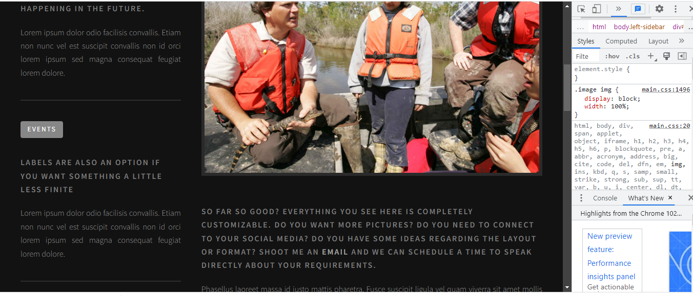
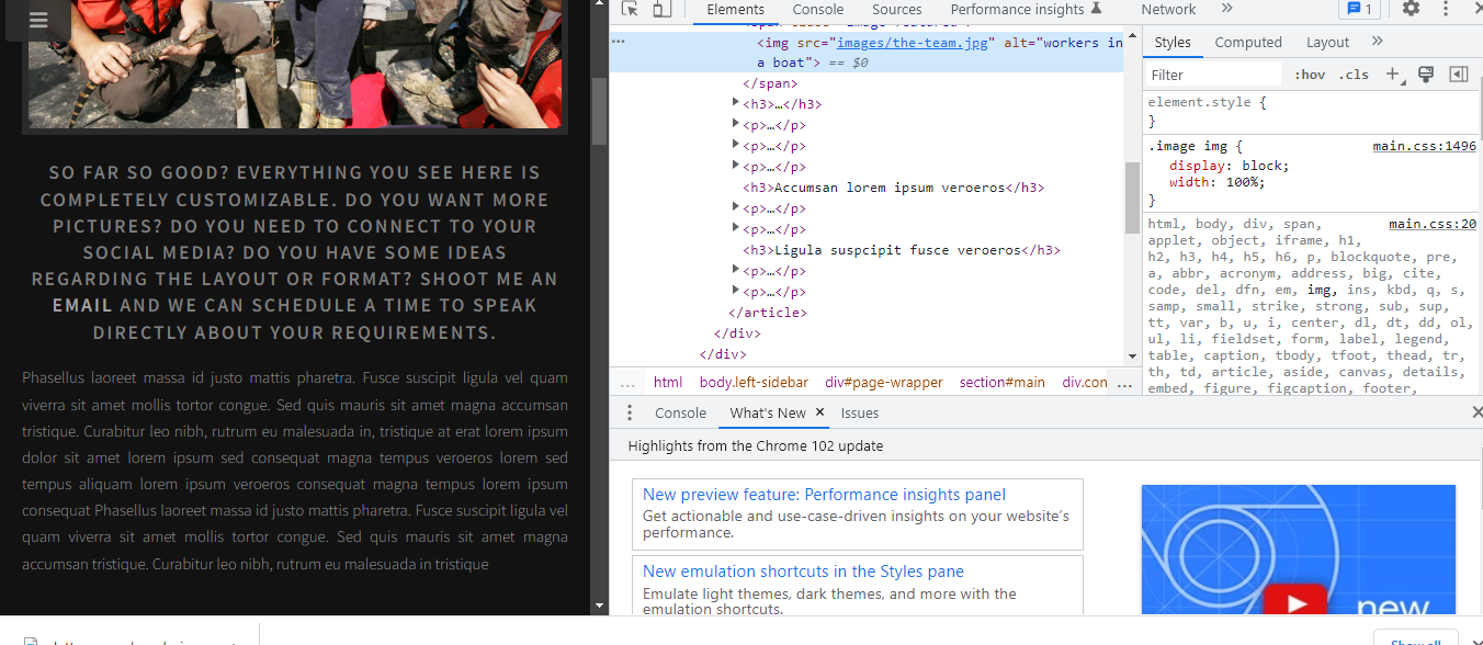
Basically, your website is optimized to look and operate amazingly no matter the device being used; however, one problem still remains. How does one inspect the responsiveness of a website without using half a dozen different devices? The answer is surprisingly simple and I will walk you through it right now in two short steps. I will be doing this tutorial in google chrome but the process is pretty much the same regardless of your browser.

First, make sure you are on a laptop or desktop computer and the responsive webpage is open in your browser then right-click anywhere on your screen. A pop-up window will open and inside it, you should see a select option. Select this option.

Next, you will see that your screen has split into two distinct sections. Hover over the line between these two sections until you see a double arrow. When you click on that line you can drag your screen back and forth. In the upper right-hand corner, you will see a pixel count and as you drag your screen to the left you will be able to see your website's page rearrange itself.

That’s pretty much it. If you take note of when each change takes place in accordance with pixel size you will have a solid understanding of what a website will look like on any given device.


